uviewUI2.x自定义tabbar
提示
太久没写uniapp了,写个小项目练练手,使用uviewUI2.x
# pages.json:
{
	"easycom": {
		"^u-(.*)": "uview-ui/components/u-$1/u-$1.vue"
	},
	"pages": [ //pages数组中第一项表示应用启动页,参考:https://uniapp.dcloud.io/collocation/pages
		{
			"path": "pages/index/index",
			"style": {
				"navigationBarTitleText": "首页"
			}
		},
		{
			"path": "pages/upload/upload",
			"style": {
				"navigationBarTitleText": "上传"
			}
		},
		{
			"path": "pages/history/history",
			"style": {
				"navigationBarTitleText": "历史记录"
			}
		}
	],
	"tabBar": {
		"list": [
            //千万别写成"./pages/index/index"
             {
				"pagePath": "pages/index/index"
			},
			{
				"pagePath": "pages/history/history"
			},
			{
				"pagePath": "pages/upload/upload"
			}
		]
	},
	"globalStyle": {
		"navigationBarTextStyle": "black",
		"navigationBarTitleText": "uni-app",
		"navigationBarBackgroundColor": "#F8F8F8",
		"backgroundColor": "#F8F8F8"
	}
}
1
2
3
4
5
6
7
8
9
10
11
12
13
14
15
16
17
18
19
20
21
22
23
24
25
26
27
28
29
30
31
32
33
34
35
36
37
38
39
40
41
42
43
44
45
2
3
4
5
6
7
8
9
10
11
12
13
14
15
16
17
18
19
20
21
22
23
24
25
26
27
28
29
30
31
32
33
34
35
36
37
38
39
40
41
42
43
44
45
# 自定义封装tabbar组件:
路径:components/tabbar/tabbar.vue
<template>
	<view>
		<u-tabbar
			:value="current?current:0"
			@change="tabbarChange"
			:fixed="true"
			:placeholder="false"
			:safeAreaInsetBottom="true"
			activeColor="#dd524d"
		>
		    <u-tabbar-item text="首页" icon="home"></u-tabbar-item>
			<u-tabbar-item text="历史记录" icon="home"></u-tabbar-item>
			<u-tabbar-item text="上传" icon="photo"></u-tabbar-item>
		</u-tabbar>
	</view>
</template>

<script>
	export default {
		props:{
			current:Number
		},
		data() {
			return {
				list: [
				{path: "pages/index/index"},
				{path: "pages/history/history"},
				{path: "pages/upload/upload"}]
			}
		},
		methods:{
			tabbarChange(e) {
				console.log(e)
			            uni.switchTab({
			                url: '/'+this.list[e].path
			            })
			        }
		}
	}
</script>

<style lang="scss">

</style>
1
2
3
4
5
6
7
8
9
10
11
12
13
14
15
16
17
18
19
20
21
22
23
24
25
26
27
28
29
30
31
32
33
34
35
36
37
38
39
40
41
42
43
44
2
3
4
5
6
7
8
9
10
11
12
13
14
15
16
17
18
19
20
21
22
23
24
25
26
27
28
29
30
31
32
33
34
35
36
37
38
39
40
41
42
43
44
# 使用
一定要暴露出来一个current的变量,在使用的时候设置选中值,不可以在组件的点击事件中更改value的值(也就是第几个被选中),因为使用switchTab方法进行跳转,跳转之后,value的值会刷新变为初始值。
在其他页面中使用组件,修改current值即可
引入组件时候一定要和定义的组件名一样,这样不需要手动import进来,easycom会自动识别
列如:
// index.vue
<template>
	<view>
		<tabbar :current="0"></tabbar>
		index
	</view>
</template>

<script>
	export default {
		data() {
			return {

			}
		},
		methods: {

		}
	}
</script>

<style lang="scss">

</style>
1
2
3
4
5
6
7
8
9
10
11
12
13
14
15
16
17
18
19
20
21
22
23
24
2
3
4
5
6
7
8
9
10
11
12
13
14
15
16
17
18
19
20
21
22
23
24
# 自定义修改
# 修改大小
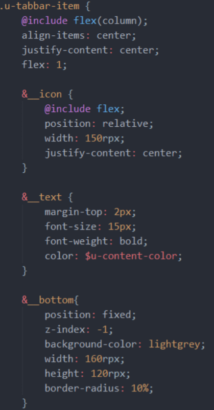
根据需要修改了u-tabbar和u-tabbar-item宽度高度,这些基本属性在uni_modules/uview-ui/components/u-tabbar/u-tabbar.vue和uni_modules/uview-ui/components/u-tabbar-item/u-tabbar-item.vue中都有相应的注释,写得很清楚,自行修改就好
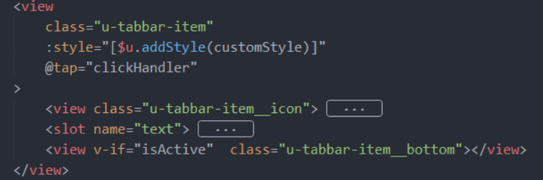
# 添加选中阴影
在原本的组件template里加入了这一行,当isActive是true的时候是被选中,显示阴影样式
<view v-if="isActive" class="u-tabbar-item__bottom"></view>
1
加入相应的样式
上次更新: 2023/09/05 17:45:42
